 ConstraintLayout高级内容
本文章汇转载自:
- [掘金]-新小梦.ConstraintLayout,看完一篇真的就够了么.https://juejin.cn/post/6844903875569254414
- [掘金]-xuyisheng.ConstraintLayout2.0一篇写不完之约束到底写在哪.https://juejin.cn/post/6969844772886282270
# 1. 简介
# 2. ConstraintLayout
ConstraintLayout作为一款可以灵活调整view位置和大小的Viewgroup被Google疯狂推荐,以前创建布局,默认根元素都是LinearLayout,现在是ConstraintLayout了。ConstraintLayout能够以支持库的形式最小支持到 API 9,同时也在不断的丰富ConstraintLayout的API和功能。ConstraintLayout在复杂布局中能够有效的,降低布局的层级,提高性能,使用更加灵活。
在app组件的Graldle默认都有如下依赖:
// 可能版本不一样哦
implementation 'com.android.support.constraint:constraint-layout:1.1.3
2
迫不及待想了解ConstraintLayout能在布局做点什么了。
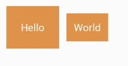
# 2.1 相对定位
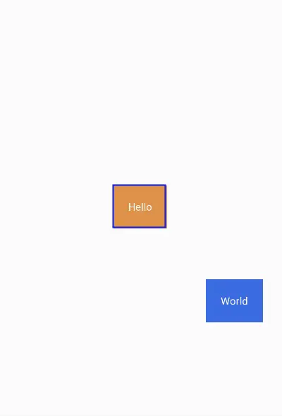
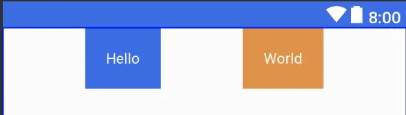
相对定位,其实这跟RelativeLayout差不多,一个View相对另外一个View的位置。
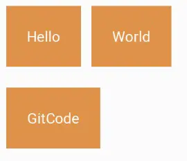
通过简单的使用ConstraintLayout的属性也就可以实现以上布局。World对于Hello的右边,GitCode对位于Hello的下边
<?xml version="1.0" encoding="utf-8"?>
<androidx.constraintlayout.widget.ConstraintLayout
    ...>
    <TextView
            ...
            android:text="Hello"
            android:id="@+id/tvHello"/>

    <TextView
            ...
            android:text="World"
            app:layout_constraintLeft_toRightOf="@+id/tvHello"/>

    <TextView
            ...
            android:text="GitCode"
            app:layout_constraintTop_toBottomOf="@id/tvHello"/>

</androidx.constraintlayout.widget.ConstraintLayout>
2
3
4
5
6
7
8
9
10
11
12
13
14
15
16
17
18
19
以TextView World相对位置属性layout_constraintLeft_toRightOf来说,constraintLeft表示TextView World本身的左边,一个View有四条边,因此TextView的上、右、下边分别对应着constraintTop、constraintRight、constraintBottom。toRightOf则表示位于另外一个View的右边,例如此处位于Hello的右边,因此对应还有toLeftOf、toRghtOf、toBottomOf,分别位于View Hello的左、右、下边。
总结的说,constraintXXX表示View自身约束的边,toXXXOf表示另一个View的边,而XXX的值可以是Left、Top、Right、Bottom,分别对应左,上、右、下边。layout_constraintStart_toEndOf也是类似的道理。
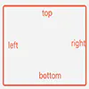
另外需要注意的是,view的位置可以相对于同层的view和parent,在相对于parent的时候toLeftOf、toTopOf、toRghtOf、toBottomOf分别表示位于parent的内部左上右下边缘。如图:红色框表示parent view。
再来看看一个特殊的场景:
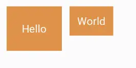
此时想要Hello和World文本中间对齐怎么办?ConstraintLayout提供了layout_constraintBaseline_toBaselineOf属性。
<TextView
   ...
    android:text="Hello"
    android:id="@+id/tvHello"/>

<TextView
    ...
    android:text="World"
    app:layout_constraintBaseline_toBaselineOf="@id/tvHello"
    app:layout_constraintLeft_toRightOf="@+id/tvHello"/>
2
3
4
5
6
7
8
9
10
此时界面就如愿了,比Relativelayout方便多了。
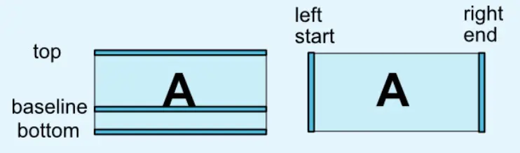
什么是baseline?贴张官网的图。
# 2.2 边距
边距与平常使用并无太大区别,但需要先确定view的位置,边距才会生效。如:
<TextView
        ...
        android:layout_marginTop="10dp"
        android:layout_marginLeft="10dp"/>
2
3
4
在其他的ViewGroup,TextView的layout_marginTop和layout_marginLeft属性是会生效的,但在ConstraintLayout不会生效,因为此时TextView的位置还没确定。下面的代码才会生效。
<TextView
        ...
        android:layout_marginTop="10dp"
        android:layout_marginLeft="10dp"
        app:layout_constraintLeft_toLeftOf="parent"
        app:layout_constraintTop_toTopOf="parent"/>
2
3
4
5
6
常用属性如下:
- android:layout_marginStart
- android:layout_marginEnd
- android:layout_marginLeft
- android:layout_marginTop
- android:layout_marginRight
- android:layout_marginBottom
# GONE Margin
有时候,会有这种需求,在World可见的时候,GitCode与World的左边距是0,当World不见时,GitCode的左边距是某个特定的值。
World可见的效果,GitCode的左边距为0
World不可见的效果,GitCode的左边距为10
为此,ConstraintLayout提供了特殊的**goneMargin**属性,在目标View隐藏时,属性生效。有如下属性:
- layout_goneMarginStart
- layout_goneMarginEnd
- layout_goneMarginLeft
- layout_goneMarginTop
- layout_goneMarginRight
- layout_goneMarginBottom
# Centering positioning and bias
在RelativeLayout居中,通常是使用以下三个属性:
- layout_centerInParent 中间居中
- layout_centerHorizontal 水平居中
- layout_centerVertical 垂直居中
而在ConstraintLayout居中则采用左右上下边来约束居中。
- 水平居中
layout_constraintLeft_toLeftOf & layout_constraintRight_toRightOf - 垂直居中
layout_constraintTop_toTopOf & layout_constraintBottom_toBottomOf - 中间居中 水平居中 & 垂直居中
举个栗子:
<TextView
    ...
    android:text="Hello"
    app:layout_constraintLeft_toLeftOf="parent"
    app:layout_constraintRight_toRightOf="parent"/>
2
3
4
5
效果图:
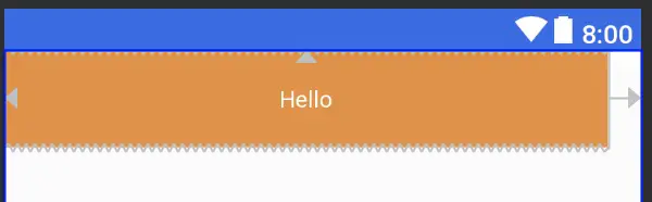
那,要是想把Hello往左挪一点,怎么办?
那很简单,使用margin呀。不不不,这里要介绍的是另外两个属性,与LinearLayout的权重类似(当然,ConstraintLayout也可以使用权重属性),但简单很多。
layout_constraintHorizontal_bias水平偏移layout_constraintVertical_bias垂直偏移
两个属性的取值范围在0-1。在水平偏移中,0表示最左,1表示最右;在垂直偏移,0表示最上,1表示最下;0.5表示中间。
<TextView
    ...
    android:text="Hello"
    app:layout_constraintHorizontal_bias="0.8"
    app:layout_constraintLeft_toLeftOf="parent"
    app:layout_constraintRight_toRightOf="parent"/>
2
3
4
5
6
效果:
# 2.3 圆形定位(Added in 1.1)
圆形定位指的是View的中心点相对于另外View中心点的位置。贴张官网图。
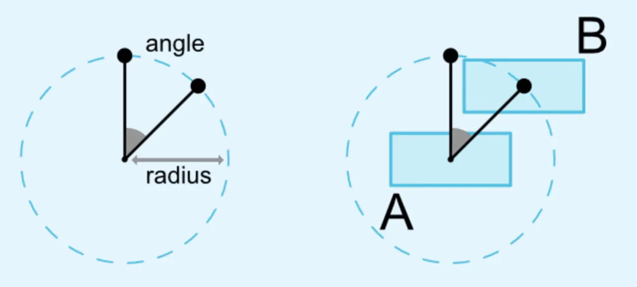
涉及三个属性:
- layout_constraintCircle : 另外一个view的id,上图的A view
- layout_constraintCircleRadius : 半径,上图的radius
- layout_constraintCircleAngle : 角度,上图angle,范围为0-360 根据上面上个属性就可以确定B View的位置。从图也可以知道,角度以时间12点为0,顺时针方式。
吃个栗子:
<TextView
    ...
    android:text="Hello"
    android:id="@+id/tvHello"
    app:layout_constraintTop_toTopOf="parent"
    app:layout_constraintBottom_toBottomOf="parent"
    app:layout_constraintLeft_toLeftOf="parent"
    app:layout_constraintRight_toRightOf="parent"/>

<TextView
    android:text="World"
    app:layout_constraintCircle="@id/tvHello"
    app:layout_constraintCircleRadius="180dp"
    app:layout_constraintCircleAngle="135"/>
2
3
4
5
6
7
8
9
10
11
12
13
14
效果图:Hello中间居中,World 135角度
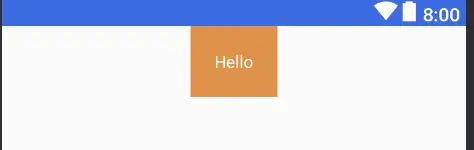
# 2.4 尺寸约束
# ConstraintLayout 最大最小尺寸
ConstraintLayout的宽高设为WRAP_CONTENT时,可以通过以下熟悉设置其最大最小尺寸。
- android:minWidth 最小宽度
- android:minHeight 最小高度
- android:maxWidth 最大宽度
- android:maxHeight 最大高度
# ConstraintLayout中的控件尺寸约束
在ConstraintLayout中控件可以三种方式来设置其尺寸约束。
- 指定具体的值。如123dp
- 使用值
WRAP_CONTENT,内容自适配。 - 设为0dp,即
MATCH_CONSTRAINT,扩充可用空间。
第一二种跟平常使用没什么区别。第三种会根据约束情况重新计算控件的大小。 在ConstraintLayout中,不推荐使用MATCH_PARENT,而是推荐使用MATCH_CONSTRAINT(0dp),它们的行为是类似的。
吃个栗子吧:
 <TextView
        android:text="Hello"
        android:id="@+id/tvHello"
        android:gravity="center"
        android:padding="20dp"
        app:layout_constraintTop_toTopOf="parent"
        android:textColor="@color/colorWhite"
        android:background="@color/colorPrimary"
        app:layout_constraintLeft_toLeftOf="parent"
        app:layout_constraintRight_toRightOf="parent"
        android:layout_width="0dp"
        android:layout_marginRight="20dp"
        android:layout_height="wrap_content"/>
2
3
4
5
6
7
8
9
10
11
12
13
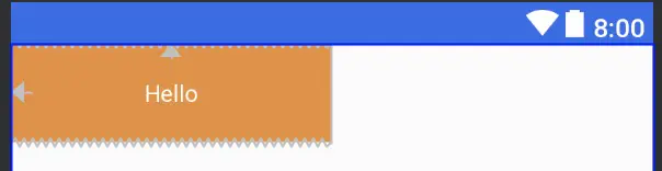
设置layout_width为0dp;
layout_height为wrap_content;
layout_marginRight为20dp,与parent左右对齐。
效果图:
在1.1之前的版本,控件尺寸设为WRAP_CONTENT,控件默认是由组件文本大小控制,其他约束是不生效的。可以通过以下属性设置是否生效。
app:layout_constrainedWidth=”true|false”app:layout_constrainedHeight=”true|false”
控件设为MATCH_CONSTRAINT时,控件的大小会扩展所有可用空间,在1.1版本后,可以通过以下属性改变控件的行为。
- layout_constraintWidth_min 最小宽度
- layout_constraintHeight_min 最小高度
- layout_constraintWidth_max 最大宽度
- layout_constraintHeight_max 最大高度
- layout_constraintWidth_percent 宽度占parent的百分比
- layout_constraintHeight_percent 高度占parent的百分比
吃个栗子:
<TextView
        android:text="Hello"
        android:id="@+id/tvHello"
        app:layout_constraintLeft_toLeftOf="parent"
        app:layout_constraintWidth_percent="0.5"
        app:layout_constraintWidth_default="percent"
        android:layout_width="0dp"
        android:layout_height="wrap_content"/>
2
3
4
5
6
7
8
将android:layout_width设为MATCH_CONSTRAINT,即0dp;将app:layout_constraintWidth_default设为percent;将app:layout_constraintWidth_percent设为0.5,表示占parent的50%,取值范围是0-1。
效果图:
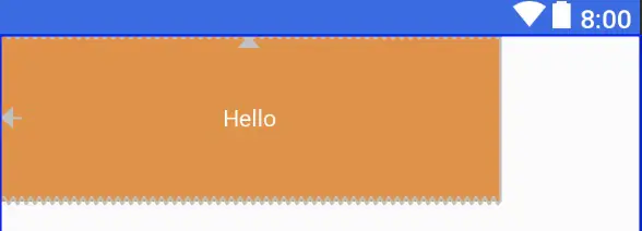
# 比例约束
控件的宽高比,要求是宽或高至少一个设为0dp,然后设置属性layout_constraintDimensionRatio即可。
<TextView
    android:text="Hello"
    app:layout_constraintDimensionRatio="3:1"
    android:layout_width="0dp"
    android:layout_height="100dp"/>
2
3
4
5
这里设置宽高比为3:1,高度为100dp,那么宽度将为300dp。
也可以在比例前加W,H表示是宽高比还是高宽比。如下面表示高宽比。
<Button android:layout_width="0dp" android:layout_height="0dp"
    app:layout_constraintDimensionRatio="H,16:9"
    app:layout_constraintBottom_toBottomOf="parent"
    app:layout_constraintTop_toTopOf="parent"/>
2
3
4
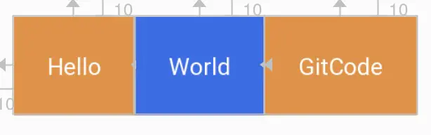
# 2.5 链
链在水平或者垂直方向提供一组类似行为。如图所示可以理解为横向链。这里需要了解一点,A与parent的左边缘约束,B与parent的右边边缘约束,A右边和B左边之间相互约束,才能使用一条链。多个元素之间也是如此,最左最右与parent约束,元素之间边相互约束。不然下面的链式永远无法生效。
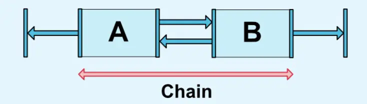
横向链最左边第一个控件,垂直链最顶边第一个控件称为链头,可以通过下面两个属性链头统一定制链的样式。
- layout_constraintHorizontal_chainStyle 水平方向链式
- layout_constraintVertical_chainStyle 垂直方向链式
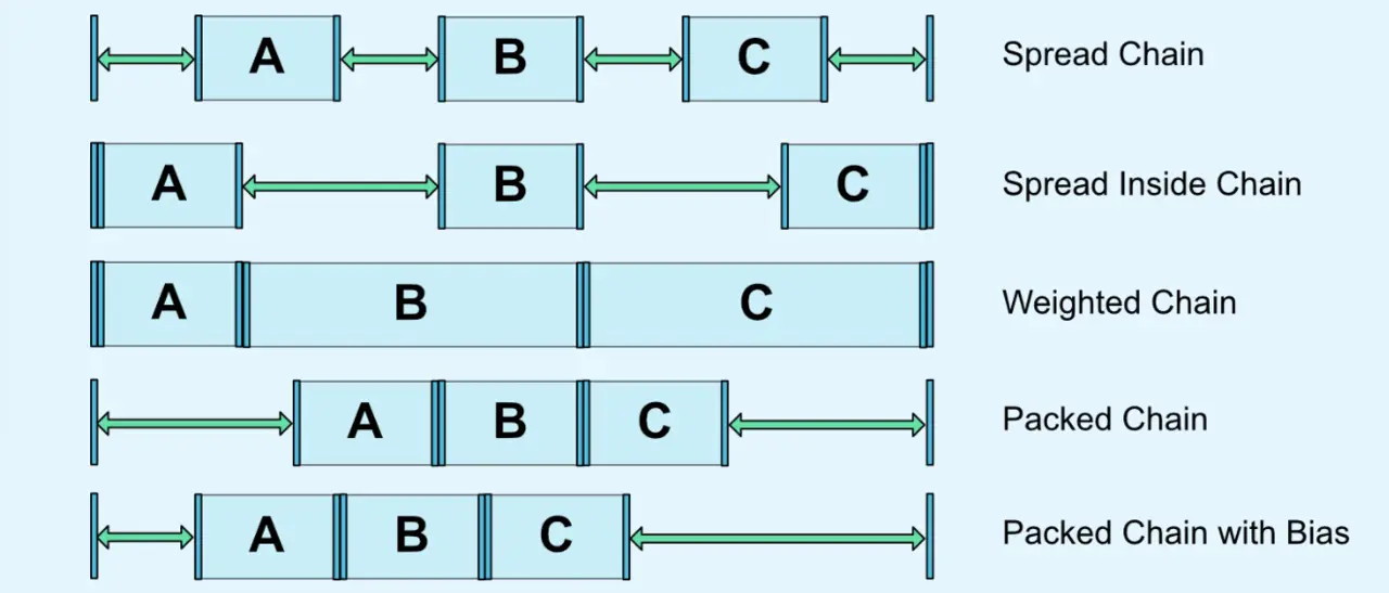
它两的值默认可以是
CHAIN_SPREAD 展开样式(默认)
Weighted chain 在CHAIN_SPREAD样式,部分控件设置了MATCH_CONSTRAINT,那他们将扩展可用空间。
CHAIN_SPREAD_INSIDE 展开样式,但两端不展开
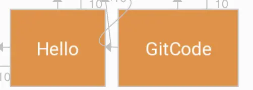
CHAIN_PACKED
抱团(打包)样式,控件抱团一起。通过偏移bias,可以改变packed元素的位置。
从实际开发,这么应用还是挺广泛的。 提供份代码参考,避免走冤枉路:
<?xml version="1.0" encoding="utf-8"?>
<android.support.constraint.ConstraintLayout
    xmlns:android="http://schemas.android.com/apk/res/android"
    xmlns:app="http://schemas.android.com/apk/res-auto"
    android:layout_width="match_parent"
    android:layout_height="match_parent">

    <TextView
            android:text="Hello"
            android:id="@+id/tvHello"
            android:gravity="center"
            android:padding="20dp"
            app:layout_constraintHorizontal_chainStyle="spread"
            app:layout_constraintLeft_toLeftOf="parent"
            app:layout_constraintRight_toLeftOf="@id/tvWorld"
            android:textColor="@color/colorWhite"
            android:background="@color/colorPrimaryDark"
            android:layout_width="wrap_content"
            android:layout_height="wrap_content"/>
    <TextView
            android:text="World"
            android:gravity="center"
            android:padding="20dp"
            android:id="@+id/tvWorld"
            app:layout_constraintLeft_toRightOf="@id/tvHello"
            app:layout_constraintRight_toRightOf="parent"
            android:textColor="@color/colorWhite"
            android:background="@color/colorPrimary"
            android:layout_width="wrap_content"
            android:layout_height="wrap_content"/>

</android.support.constraint.ConstraintLayout>
2
3
4
5
6
7
8
9
10
11
12
13
14
15
16
17
18
19
20
21
22
23
24
25
26
27
28
29
30
31
32
效果:
在链中,剩余空余空间默认平均给各元素,但有时可以通过权重属性layout_constraintVertical_weight来指定分配空间的大小。
1.1之后,在链中使用边距时,边距是相加的,也就说,假设Hello的右边距为5,World的左边距为20,那么它们之间的边距就是25。在链式,边距先从剩余空间减去的,然后再用剩余的空间在元素之间进行定位。
# 2.6 优化器
在1.1之后,公开了优化器,通过在app:layout_optimizationLevel来决定控件在哪方面进行优化。
- none : 不进行优化
- standard : 默认方式, 仅仅优化direct和barrier约束
- direct : 优化direct约束
- barrier : 优化barrier约束
- chain : 优化链约束 (实验性质)
- dimensions : 优化尺寸 (实验性质), 减少测量次数
# 3.工具类
# 3.1 Guideline(参考线)
参考线实际上不会在界面进行显示,只是方便在ConstraintLayout布局view时候做一个参考。
通过设置Guideline的属性orientation来表示是水平方向还是垂直方向的参考线,对应值为vertical和horizontal。可以通过三种方式来定位Guideline位置。
- layout_constraintGuide_begin 从左边或顶部指定具体的距离
- layout_constraintGuide_end 从右边或底部指定具体的距离
- layout_constraintGuide_percent 从宽度或高度的百分比来指定具体距离
丢个栗子:
<android.support.constraint.ConstraintLayout
    xmlns:android="http://schemas.android.com/apk/res/android"
    xmlns:app="http://schemas.android.com/apk/res-auto"
    xmlns:tools="http://schemas.android.com/tools"
    android:layout_width="match_parent"
    android:layout_height="match_parent">

    <android.support.constraint.Guideline
            android:layout_width="wrap_content"
            android:layout_height="wrap_content"
            android:id="@+id/guideline"
            android:orientation="vertical"
            app:layout_constraintGuide_begin="10dp"/>

    <Button android:text="Button"
            android:layout_width="wrap_content"
            android:layout_height="wrap_content"
            android:id="@+id/button"
            app:layout_constraintLeft_toLeftOf="@+id/guideline"
            android:layout_marginTop="16dp"
            app:layout_constraintTop_toTopOf="parent"/>

    <Button android:text="Button2"
            android:layout_width="wrap_content"
            android:layout_height="wrap_content"
            android:id="@+id/button2"
            app:layout_constraintLeft_toLeftOf="@+id/guideline"
            android:layout_marginTop="16dp"
            app:layout_constraintTop_toBottomOf="@id/button"/>
</android.support.constraint.ConstraintLayout>
2
3
4
5
6
7
8
9
10
11
12
13
14
15
16
17
18
19
20
21
22
23
24
25
26
27
28
29
30
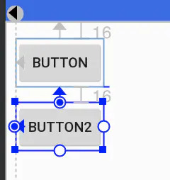
Guideline设置为垂直参考线,距离开始的位置为10dp。如下图所示,实际中需要把鼠标移到button才会显示出来哦。
# 3.2 Barrier(栅栏)
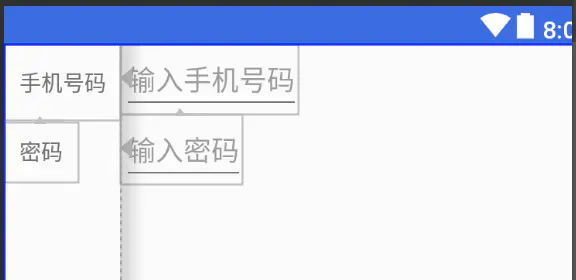
Barrier有点类似Guideline,但Barrier会根据所有引用的控件尺寸的变化重新定位。例如经典的登录界面,右边的EditText总是希望与左右所有TextView的最长边缘靠齐。 如果两个TextView其中一个变得更长,EditText的位置都会跟这变化,这比使用RelativeLayout灵活很多。
代码:
<android.support.constraint.ConstraintLayout
        xmlns:android="http://schemas.android.com/apk/res/android"
        xmlns:app="http://schemas.android.com/apk/res-auto"
        android:layout_width="match_parent"
        android:layout_height="match_parent">

    <android.support.constraint.Barrier
            android:layout_width="wrap_content"
            android:layout_height="wrap_content"
            app:barrierDirection="right"
            android:id="@+id/barrier"
            app:constraint_referenced_ids="tvPhone,tvPassword"
            />

    <TextView android:layout_width="wrap_content"
              android:text="手机号码"
              android:id="@+id/tvPhone"
              android:gravity="center_vertical|left"
              android:padding="10dp"
              android:layout_height="50dp"/>

    <TextView android:layout_width="wrap_content"
              android:text="密码"
              android:padding="10dp"
              android:gravity="center_vertical|left"
              android:id="@+id/tvPassword"
              app:layout_constraintTop_toBottomOf="@id/tvPhone"
              android:layout_height="wrap_content"/>

    <EditText android:layout_width="wrap_content"
              android:hint="输入手机号码"
              android:id="@+id/etPassword"
              app:layout_constraintLeft_toLeftOf="@id/barrier"
              android:layout_height="wrap_content"/>

    <EditText android:layout_width="wrap_content"
              android:hint="输入密码"
              app:layout_constraintTop_toBottomOf="@id/etPassword"
              app:layout_constraintLeft_toLeftOf="@id/barrier"
              android:layout_height="wrap_content"/>


</android.support.constraint.ConstraintLayout>
2
3
4
5
6
7
8
9
10
11
12
13
14
15
16
17
18
19
20
21
22
23
24
25
26
27
28
29
30
31
32
33
34
35
36
37
38
39
40
41
42
43
app:barrierDirection所引用控件对齐的位置,可设置的值有:bottom、end、left、right、start、top.constraint_referenced_ids为所引用的控件,例如这里的tvPhone,tvPasswrod。
# 3.3 Group(组)
用来控制一组view的可见性,如果view被多个Group控制,则以最后的Group定义的可见性为主。
吃个香喷喷栗子吧: Group默认可见时,是这样的。
设置Group的visible属性为gone.
<android.support.constraint.ConstraintLayout
        xmlns:android="http://schemas.android.com/apk/res/android"
        xmlns:app="http://schemas.android.com/apk/res-auto"
        android:layout_width="match_parent"
        android:layout_height="match_parent">

    <android.support.constraint.Group
            android:layout_width="wrap_content"
            android:layout_height="wrap_content"
            android:id="@+id/group"
            android:visibility="gone"
            app:constraint_referenced_ids="tvPhone,tvPassword"/>

    <TextView android:layout_width="wrap_content"
              android:text="手机号码"
              android:id="@+id/tvPhone"
              android:gravity="center_vertical|left"
              android:padding="10dp"
              android:layout_height="50dp"/>

    <TextView android:layout_width="wrap_content"
              android:text="密码"
              android:padding="10dp"
              android:gravity="center_vertical|left"
              android:id="@+id/tvPassword"
              app:layout_constraintLeft_toRightOf="@id/tvPhone"
              app:layout_constraintTop_toBottomOf="@id/tvPhone"
              android:layout_height="wrap_content"/>

    <TextView android:layout_width="wrap_content"
              android:text="GitCode"
              android:padding="10dp"
              android:gravity="center_vertical|left"
              app:layout_constraintLeft_toRightOf="@id/tvPassword"
              android:layout_height="wrap_content"/>

</android.support.constraint.ConstraintLayout>
2
3
4
5
6
7
8
9
10
11
12
13
14
15
16
17
18
19
20
21
22
23
24
25
26
27
28
29
30
31
32
33
34
35
36
37
效果就变成了这样了,tvPhone,tvPassword都被隐藏了。
# 3.4 Placeholder(占位符)
一个view占位的占位符,当指定Placeholder的content属性为另一个view的id时,该view会移动到Placeholder的位置。
代码中,将TextView的定位在屏幕中间,随着将id设置给Placeholder的属性后,TextView的位置就跑到Placeholder所在的地方,效果图跟上图一直。
<android.support.constraint.ConstraintLayout
        xmlns:android="http://schemas.android.com/apk/res/android"
        xmlns:app="http://schemas.android.com/apk/res-auto"
        android:layout_width="match_parent"
        android:layout_height="match_parent">

    <android.support.constraint.Placeholder
            android:layout_width="wrap_content"
            android:layout_height="wrap_content"
            app:content="@id/tvGitCode"
              />

    <TextView android:layout_width="wrap_content"
              android:text="GitCode"
              android:id="@+id/tvGitCode"
              android:padding="10dp"
              app:layout_constraintLeft_toLeftOf="parent"
              app:layout_constraintRight_toRightOf="parent"
              android:gravity="center_vertical|left"
              android:layout_height="wrap_content"/>

</android.support.constraint.ConstraintLayout>
2
3
4
5
6
7
8
9
10
11
12
13
14
15
16
17
18
19
20
21
22
# 3.5 其他
在2.0,为ConstraintLayout增加了ConstraintProperties、ConstraintsChangedListener等,感兴趣可以自己看看官网。