 Android仿微信底部菜单栏+今日头条顶部导航栏
# 前言
现在很多APP功能点比较多,涉及的页面比较多,而底部又无法添加很多个Tab,底部导航栏基本都是4-5的样子。无法容纳更多页面,此时顶部导航栏采用TabLayout + ViewPager的方式来切换Fragment。
本节我们实现两种主要的Tab效果:
- 仿微信底部菜单
- 仿今日头条顶部导航条
Demo详见:https://github.com/IQQcode/WaddleConvince/tree/main/LayoutDesign/01TabLayoutNavigationGuide
效果预览:

# 底部菜单
Tab一般与Activity或Fragment配合使用,以达到多页面切换效果,这里使用Fragment来开发子界面。
微信形式的底部菜单可以理解为一个外层Activity,套用几个Fragment。页面布局层次为:
MainActivity 主框架
- HomePageFragment 微信
- maillistFragment 通讯录
- FindFragment 发现
- MeFragment 我
做出来的效果:

# 基本布局
activity_main布局
ViewPager + TabLayout上下结构:

<?xml version="1.0" encoding="utf-8"?>
<LinearLayout xmlns:android="http://schemas.android.com/apk/res/android"
    xmlns:app="http://schemas.android.com/apk/res-auto"
    xmlns:tools="http://schemas.android.com/tools"
    android:layout_width="match_parent"
    android:layout_height="match_parent"
    android:orientation="vertical"
    tools:context=".MainActivity">

    <androidx.viewpager.widget.ViewPager
        android:id="@+id/view_pager"
        android:layout_width="match_parent"
        android:layout_height="0dp"
        android:layout_weight="1"/>

    <View
        android:layout_width="match_parent"
        android:layout_height="0.5dp"
        android:background="@color/line_gray" />

    <com.google.android.material.tabs.TabLayout
        android:id="@+id/tab_layout"
        android:layout_width="match_parent"
        android:layout_height="54dp"
        app:tabIndicatorHeight="0dp"/>

</LinearLayout>
2
3
4
5
6
7
8
9
10
11
12
13
14
15
16
17
18
19
20
21
22
23
24
25
26
27
Tab自定义视图item_main_menu.xml
自定义视图包含一个上方图标和下方的文字,使用自定义视图的好处就是图标大小方便修改,文字颜色啥的都好改,比较随心。
<?xml version="1.0" encoding="utf-8"?>
<LinearLayout xmlns:android="http://schemas.android.com/apk/res/android"
    android:layout_width="match_parent"
    android:layout_height="match_parent"
    android:gravity="center_horizontal"
    android:orientation="vertical">

    <ImageView
        android:id="@+id/img_tab"
        android:layout_width="24dip"
        android:layout_height="24dip"
        android:src="@drawable/menu_msg_default" />

    <TextView
        android:id="@+id/txt_tab"
        android:layout_width="wrap_content"
        android:layout_height="wrap_content"
        android:layout_marginTop="2dip"
        android:text="首页"
        android:textColor="@drawable/txt_main_menu_selector"
        android:textSize="11sp" />

</LinearLayout>
2
3
4
5
6
7
8
9
10
11
12
13
14
15
16
17
18
19
20
21
22
23
Tab图标selector
以第一个Tab“微信”使用的图标为例,tab_main_msg_selector.xml内容
<?xml version="1.0" encoding="utf-8"?>
<selector xmlns:android="http://schemas.android.com/apk/res/android">
    <item android:drawable="@drawable/menu_msg_selected" android:state_pressed="true" />
    <item android:drawable="@drawable/menu_msg_selected" android:state_selected="true" />
    <item android:drawable="@drawable/menu_msg_default" />
</selector>
2
3
4
5
6
使用到了两张图片:menu_msg_default、menu_msg_selected,一张默认图样式,一张选中图样式,对比如下:

Tab文字selector
因为Tab选中时需要做区分,所以文字颜色与图标一起变动会更好看,文字颜色也需要写selector。
<?xml version="1.0" encoding="utf-8"?>
<selector xmlns:android="http://schemas.android.com/apk/res/android">
    <item android:color="@color/menu_green" android:state_selected="true"></item>
    <item android:color="@color/menu_gray"></item>
</selector>
2
3
4
5
6
menu_gray是默认状态的灰色,menu_green是选中时呈现的绿色。
# 页面切换Adapter
页面切换内容由ViewPager的adapter对象完成,使用Fragment作为子页面时,Adapter需要是FragmentPagerAdapter的实例,由于底部是四个Tab,所以要添加四个Fragment:
主界面底部菜单适配器 ViewPager的Adapter
public class MainFragmentAdapter extends FragmentPagerAdapter {

    private List<BaseFragment> fragmentList;

    public MainFragmentAdapter(@NonNull FragmentManager fm) {
        super(fm);
        addFragmentContainer();
    }

    private void addFragmentContainer() {
        fragmentList = new ArrayList<>();
        fragmentList.add(new HomePageFragment());
        fragmentList.add(new MailListFragment());
        fragmentList.add(new FindFragment());
        fragmentList.add(new MeFragment());
    }

    @NonNull
    @Override
    public Fragment getItem(int position) {
        return fragmentList.get(position);
    }

    @Override
    public int getCount() {
        return fragmentList.size();
    }

//    @Nullable
//    @Override
//    public CharSequence getPageTitle(int position) {
//        // 不用在主Activity添加tab标题,这里直接设置
//        return fragmentList.get(position).getTitle();
//    }

    /**
     * 防止viewpager在滑动切换的时候,里面的fragment被销毁,导致数据需要重新加载
     * @param container
     * @param position
     * @param object
     */
    @Override
    public void destroyItem(@NonNull ViewGroup container, int position, @NonNull Object object) {
        super.destroyItem(container, position, object);
    }
}
2
3
4
5
6
7
8
9
10
11
12
13
14
15
16
17
18
19
20
21
22
23
24
25
26
27
28
29
30
31
32
33
34
35
36
37
38
39
40
41
42
43
44
45
46
【说明】:
- getItem返回具体位置的viewPager切换到i位置时对应的fragment,因为主框架的视图是固定的,所以在这里根据i的值返回对应的fragment对象即可;
- getItem中返回的fragment也可以携带一些参数,如果需要的话;
- getCount返回视图的总数量,这里是取ArrayList的size(ArrayList存放Tab页面的Fragment)。
# 子页面实例
本例中的子页面只是呈现一个简单的文字,实际开发中根据需要写入相应布局和功能替换即可。这里以MeFragment作为示例:
MeFragment.java
public class MeFragment extends BaseFragment {

    private ImageView mImageView;
    private TextView mTextView;
    public MeFragment() { }

    @Override
    public View onCreateView(LayoutInflater inflater, ViewGroup container, Bundle savedInstanceState) {
        View view = inflater.inflate(R.layout.fragment_continer_layout, container, false);
        mImageView = view.findViewById(R.id.binner_image);
        mTextView = view.findViewById(R.id.binner_title);
        mTextView.setText("我的内容");
        mImageView.setImageResource(R.drawable.tab_me);
        return view;
    }
}
2
3
4
5
6
7
8
9
10
11
12
13
14
15
16
17
fragment_continer_layout.xml
<?xml version="1.0" encoding="utf-8"?>
<RelativeLayout xmlns:android="http://schemas.android.com/apk/res/android"
    android:layout_width="match_parent"
    android:layout_height="match_parent"
    android:orientation="vertical">

    <ImageView
        android:id="@+id/binner_image"
        android:layout_width="300dp"
        android:layout_height="400dp"
        android:layout_centerHorizontal="true"
        android:src="@drawable/tab_chat"
        android:layout_marginTop="50dp" />

    <TextView
        android:id="@+id/binner_title"
        android:layout_below="@id/binner_image"
        android:layout_width="wrap_content"
        android:layout_height="wrap_content"
        android:textSize="30dp"
        android:text="test"
        android:textStyle="bold"
        android:layout_marginTop="20dp"
        android:layout_centerHorizontal="true"/>

</RelativeLayout>
2
3
4
5
6
7
8
9
10
11
12
13
14
15
16
17
18
19
20
21
22
23
24
25
26
# MainActivity
package top.iqqcode.guide;

import androidx.appcompat.app.AppCompatActivity;
import androidx.viewpager.widget.PagerAdapter;
import androidx.viewpager.widget.ViewPager;

import android.os.Bundle;
import android.view.KeyEvent;
import android.view.LayoutInflater;
import android.view.View;
import android.widget.ImageView;
import android.widget.TextView;

import com.google.android.material.snackbar.Snackbar;
import com.google.android.material.tabs.TabLayout;

import top.iqqcode.guide.adapter.MainFragmentAdapter;

public class MainActivity extends AppCompatActivity {

    // 底部导航Tab资源文件
    private final int[] TAB_TILES = new int[] {R.string.menu_msg, R.string.menu_content, R.string.menu_find, R.string.menu_me};
    private final int[] TAB_IMAGES = new int[] {R.drawable.tab_main_msg_selector, R.drawable.tab_main_contact_selector, R.drawable.tab_main_find_selector, R.drawable.tab_main_me_selector};

    private ViewPager mViewPager;
    private TabLayout mTabLayout;

    private PagerAdapter mAdapter; // ViewPager Adapter
    private long exitTime;

    @Override
    protected void onCreate(Bundle savedInstanceState) {
        super.onCreate(savedInstanceState);
        setContentView(R.layout.activity_main);

        initView();
        initPager();
        setTabs(mTabLayout, getLayoutInflater(), TAB_TILES, TAB_IMAGES);
    }

    private void initView() {
        mViewPager = findViewById(R.id.view_pager);
        mTabLayout = findViewById(R.id.tab_layout);
    }

    // 初始化选项卡
    private void initPager() {
        mAdapter = new MainFragmentAdapter(getSupportFragmentManager());
        mViewPager.setAdapter(mAdapter);
        // 关联切换
        mViewPager.addOnPageChangeListener(new TabLayout.TabLayoutOnPageChangeListener(mTabLayout));
        mTabLayout.addOnTabSelectedListener(new TabLayout.OnTabSelectedListener() {
            @Override
            public void onTabSelected(TabLayout.Tab tab) {
                // 取消平滑切换
                mViewPager.setCurrentItem(tab.getPosition(), false);
            }

            @Override
            public void onTabUnselected(TabLayout.Tab tab) {

            }

            @Override
            public void onTabReselected(TabLayout.Tab tab) {

            }
        });
    }

    /**
     * 设置底部页卡显示效果
     * @param mTabLayout
     * @param layoutInflater
     * @param tabTitles
     * @param tabImages
     */
    private void setTabs(TabLayout mTabLayout, LayoutInflater layoutInflater, int[] tabTitles, int[] tabImages) {
        for (int i = 0; i < tabImages.length; i++) {
            // 新建new tab
            TabLayout.Tab tab = mTabLayout.newTab();
            View view = layoutInflater.inflate(R.layout.item_main_menu, null);
            // 使用自定义视图,目的是为了便于修改,也可使用自带的视图
            tab.setCustomView(view);

            TextView tvTitle = (TextView) view.findViewById(R.id.txt_tab);
            tvTitle.setText(tabTitles[i]);
            ImageView imgTab = (ImageView) view.findViewById(R.id.img_tab);
            imgTab.setImageResource(tabImages[i]);
            mTabLayout.addTab(tab);
        }
    }

    @Override
    public boolean dispatchKeyEvent(KeyEvent event) {
        if (event.getKeyCode() == KeyEvent.KEYCODE_BACK
                && event.getAction() == KeyEvent.ACTION_DOWN
                && event.getRepeatCount() == 0) {
            // 重写键盘事件分发,onKeyDown方法某些情况下捕获不到,只能在这里写
            if ((System.currentTimeMillis() - exitTime) > 2000) {
                Snackbar snackbar = Snackbar.make(mViewPager, "再按一次退出程序", Snackbar.LENGTH_SHORT);
                snackbar.getView().setBackgroundResource(R.color.purple_200);
                snackbar.show();
                exitTime = System.currentTimeMillis();
            } else {
                finish();
            }
            return true;
        }
        return super.dispatchKeyEvent(event);
    }
}
2
3
4
5
6
7
8
9
10
11
12
13
14
15
16
17
18
19
20
21
22
23
24
25
26
27
28
29
30
31
32
33
34
35
36
37
38
39
40
41
42
43
44
45
46
47
48
49
50
51
52
53
54
55
56
57
58
59
60
61
62
63
64
65
66
67
68
69
70
71
72
73
74
75
76
77
78
79
80
81
82
83
84
85
86
87
88
89
90
91
92
93
94
95
96
97
98
99
100
101
102
103
104
105
106
107
108
109
110
111
112
MainActivity作为主框架,使用ViewPager实现4个子页面Fragment的切换,使用TabLayout绑定ViewPager来切换视图,实现了Tab卡切换、ViewPager滑动页面的效果,基本实现了微信主框架的效果。
# 顶部导航条
TabLayout放在顶部的时候,加上一些属性配置,就可以完美实现顶部导航的效果。根据导航条样式,这里分为三类:
- 自适应非固定条数形式;
- 居中固定条数形式;
- 平铺固定条数形式。
# 自适应非固定条数
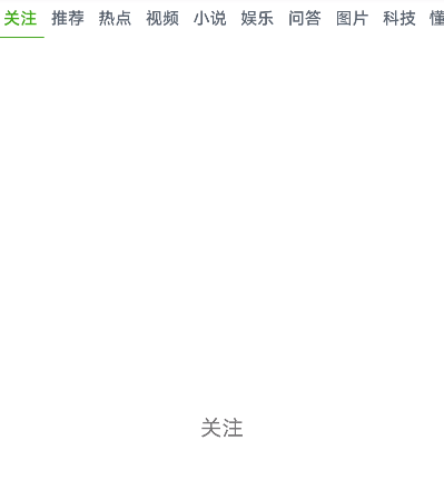
这种就是和今日头条类似的形式,适用于顶部菜单数量不固定,而且比较多的情况。
从左至右依次排放,每个菜单的内容均完全显示,长度根据内容自动伸缩,超长后的菜单需要滚动显示。
看下效果:
为了方便,源码写在HomePageFragment中,也就是第一个子页面“微信”中。
HomePageFragment.java
public class HomePageFragment extends BaseFragment {

    private View rootView;

    private List<String> names;
    private BasePageFragmentAdapter mAdapter;
    private ViewPager mViewPager;
    private TabLayout mTabLayout;

    public HomePageFragment() {
        super();
    }

    @Override
    public void onCreate(@Nullable Bundle savedInstanceState) {
        super.onCreate(savedInstanceState);
        initData();
    }

    @Nullable
    @Override
    public View onCreateView(@NonNull LayoutInflater inflater, @Nullable ViewGroup container, @Nullable Bundle savedInstanceState) {
        rootView = inflater.inflate(R.layout.fragment_homepage_head, null);
        initView();
        mAdapter = new BasePageFragmentAdapter(getChildFragmentManager());
        mViewPager.setAdapter(mAdapter);
        mTabLayout.setupWithViewPager(mViewPager);

        // 更新适配器数据
        mAdapter.setList(names);
        return rootView;
    }

    private void initView() {
        mViewPager = rootView.findViewById(R.id.homepage_view_pager);
        mTabLayout = rootView.findViewById(R.id.homepage_tab_layout);
    }

    @Override
    public void onActivityCreated(@Nullable Bundle savedInstanceState) {
        super.onActivityCreated(savedInstanceState);
    }

    private void initData() {
        names = new ArrayList<>();
        names.add("关注");
        names.add("推荐");
        names.add("热点");
        names.add("视频");
        names.add("小说");
        names.add("娱乐");
        names.add("问答");
        names.add("图片");
        names.add("科技");
        names.add("懂车帝");
        names.add("体育");
        names.add("财经");
        names.add("军事");
        names.add("国际");
        names.add("健康");
    }
}
2
3
4
5
6
7
8
9
10
11
12
13
14
15
16
17
18
19
20
21
22
23
24
25
26
27
28
29
30
31
32
33
34
35
36
37
38
39
40
41
42
43
44
45
46
47
48
49
50
51
52
53
54
55
56
57
58
59
60
61
62
这里采用的是将Fragment的标题放入到集合中,也可以在Activity初始化时传入到Fragment中,通过getTitle来获取
	@Nullable
    @Override
    public CharSequence getPageTitle(int position) {
        // 不用在主Activity添加tab标题,这里直接设置
        return container.get(position).getTitle();
    }
2
3
4
5
6
详情使用见Demo:https://github.com/IQQcode/MobileCoding/tree/main/Android-Base/02-UI%20Controls/c-Component/TabLayout-ViewPager/TabLayout01
fragment_homepage_head.xml
布局有主界面比较相似,不过TabLayout被放在顶部了。
【说明】:
app:tabMode=“scrollable”
tabMode的值设为scrollable,表示tab卡过多时自动滑动。
<?xml version="1.0" encoding="utf-8"?>
<LinearLayout xmlns:android="http://schemas.android.com/apk/res/android"
    xmlns:app="http://schemas.android.com/apk/res-auto"
    xmlns:tools="http://schemas.android.com/tools"
    android:layout_width="match_parent"
    android:layout_height="match_parent"
    android:orientation="vertical"
    tools:context=".fragment.MsgFragment">

    <android.support.design.widget.TabLayout
        android:id="@+id/tab_layout"
        android:layout_width="match_parent"
        android:layout_height="34dip"
        app:tabBackground="@color/white"
        app:tabIndicatorColor="@color/menu_green"
        app:tabIndicatorHeight="1dip"
        app:tabMode="scrollable"
        app:tabMinWidth="40dip"
        app:tabPaddingStart="5dip"
        app:tabPaddingEnd="5dip"
        app:tabSelectedTextColor="@color/wx_head_selected"
        app:tabTextAppearance="@style/tab_head"
        app:tabTextColor="@color/wx_head_default" />

    <android.support.v4.view.ViewPager
        android:id="@+id/view_pager"
        android:layout_width="match_parent"
        android:layout_height="match_parent"
        android:layout_marginTop="10dip"
        android:layout_weight="1"
        android:background="@color/white" />
</LinearLayout>
2
3
4
5
6
7
8
9
10
11
12
13
14
15
16
17
18
19
20
21
22
23
24
25
26
27
28
29
30
31
32
# 消息内容子页面适配器
BasePageFragmentAdapter.java
因为内容页大多近似,所以采用同一个Fragment布局即可,内容根据传参来修改。
public class BasePageFragmentAdapter extends FragmentPagerAdapter {

    private List<String> names;

    public BasePageFragmentAdapter(FragmentManager fm) {
        super(fm);
        this.names = new ArrayList<>();
    }

    /**
     * 数据列表
     * @param datas
     */
    public void setList(List<String> datas) {
        this.names.clear();
        this.names.addAll(datas);
        notifyDataSetChanged();
    }

    @Override
    public Fragment getItem(int position) {
        ViewContainerFragment fragment = new ViewContainerFragment();
        Bundle bundle = new Bundle();
        bundle.putString("name", names.get(position));
        fragment.setArguments(bundle);
        return fragment;
    }

    @Override
    public int getCount() {
        return names.size();
    }

    @Override
    public CharSequence getPageTitle(int position) {
        String plateName = names.get(position);
        if (plateName == null) {
            plateName = "";
        } else if (plateName.length() > 15) {
            plateName = plateName.substring(0, 15) + "...";
        }
        return plateName;
    }
}
2
3
4
5
6
7
8
9
10
11
12
13
14
15
16
17
18
19
20
21
22
23
24
25
26
27
28
29
30
31
32
33
34
35
36
37
38
39
40
41
42
43
44
# 消息内容页
子页面只放了一个TextView用来显示参数,ViewContainerFragment.java:
public class ViewContainerFragment extends BaseFragment {
    TextView tvContent;

    private String name;

    @Override
    public void onCreate(@Nullable Bundle savedInstanceState) {
        super.onCreate(savedInstanceState);


        Bundle bundle = getArguments();
        name = bundle.getString("name");
        if (name == null) {
            name = "参数非法";
        }
    }

    @Override
    public View onCreateView(LayoutInflater inflater, ViewGroup container, Bundle savedInstanceState) {
        View view = inflater.inflate(R.layout.fragment_msg_content, container, false);
        tvContent = view.findViewById(R.id.txt_content);
        tvContent.setText(name);
        return view;
    }

}
2
3
4
5
6
7
8
9
10
11
12
13
14
15
16
17
18
19
20
21
22
23
24
25
26
页面布局fragment_msg_content.xml:
<?xml version="1.0" encoding="utf-8"?>
<RelativeLayout xmlns:android="http://schemas.android.com/apk/res/android"
    xmlns:tools="http://schemas.android.com/tools"
    android:layout_width="match_parent"
    android:layout_height="match_parent">

    <TextView
        android:id="@+id/txt_content"
        android:layout_width="wrap_content"
        android:layout_height="wrap_content"
        android:layout_centerInParent="true"
        android:text="Hello blank fragment"
        android:textSize="18sp" />

</RelativeLayout>
2
3
4
5
6
7
8
9
10
11
12
13
14
15
# Tablayut居中设置
# 居中固定条数
这种形式的导航栏位于水平居中位置,适用于顶部菜单数量较少的情况。
从左至右依次排放,菜单整体位于水平居中位置,因为数量较少,一般不会滚动显示。
看下效果:

由于界面构建原理与上述内容一致,在此仅说明不同之处:
<?xml version="1.0" encoding="utf-8"?>
<LinearLayout xmlns:android="http://schemas.android.com/apk/res/android"
    xmlns:app="http://schemas.android.com/apk/res-auto"
    xmlns:tools="http://schemas.android.com/tools"
    android:layout_width="match_parent"
    android:layout_height="match_parent"
    android:orientation="vertical">

    <com.google.android.material.tabs.TabLayout
        android:id="@+id/maillist_tab_layout"
        android:layout_width="match_parent"
        android:layout_height="34dip"
        android:background="@color/white"
        app:tabBackground="@color/white"
        app:tabGravity="center"
        app:tabIndicatorHeight="0dip"
        app:tabMinWidth="40dip"
        app:tabMode="fixed"
        app:tabPaddingEnd="5dip"
        app:tabPaddingStart="5dip"
        app:tabSelectedTextColor="@color/wx_head_selected"
        app:tabTextAppearance="@style/tab_head"
        app:tabTextColor="@color/wx_head_default" />

    <androidx.viewpager.widget.ViewPager
        android:id="@+id/maillist_view_pager"
        android:layout_width="match_parent"
        android:layout_height="match_parent"
        android:layout_marginTop="10dip"
        android:layout_weight="1"
        android:background="@color/white" />

</LinearLayout>
2
3
4
5
6
7
8
9
10
11
12
13
14
15
16
17
18
19
20
21
22
23
24
25
26
27
28
29
30
31
32
33
TabLayout有两个属性与“自适应非固定条数”形式不一样:
app:tabMode=“fixed”
tabMode的值设置为fixed(默认值,也可以不加该属性),表示TabLayout的内容最大长度不会超过自身长度,也就是说不会出现滚动条,添加这个属性时,如果Tab过多,则会比较挤,出现Tab内部内容换行的情况。
app:tabGravity=“center”
tabGravity定义Tab内部的对齐方式,当该属性值为center时,表示居中对齐,不进行拉伸,根据Tab内容自适应宽度。
# 平铺固定条数
Tab平均分配宽度,适用于顶部菜单数量固定,且需要撑满页面的情况。
从左至右依次排放,菜单内容填满整个TabLayout控件,不会滚动显示。
看下效果:

<?xml version="1.0" encoding="utf-8"?>
<LinearLayout xmlns:android="http://schemas.android.com/apk/res/android"
    xmlns:app="http://schemas.android.com/apk/res-auto"
    xmlns:tools="http://schemas.android.com/tools"
    android:layout_width="match_parent"
    android:layout_height="match_parent"
    android:orientation="vertical">

    <com.google.android.material.tabs.TabLayout
        android:id="@+id/find_tab_layout"
        android:layout_width="match_parent"
        android:layout_height="34dip"
        android:background="@color/white"
        app:tabBackground="@color/white"
        app:tabGravity="fill"
        app:tabIndicatorHeight="0dip"
        app:tabMinWidth="40dip"
        app:tabMode="fixed"
        app:tabPaddingEnd="5dip"
        app:tabPaddingStart="5dip"
        app:tabSelectedTextColor="@color/wx_head_selected"
        app:tabTextAppearance="@style/tab_head"
        app:tabTextColor="@color/wx_head_default"/>

    <androidx.viewpager.widget.ViewPager
        android:id="@+id/find_view_pager"
        android:layout_width="match_parent"
        android:layout_height="match_parent"
        android:layout_marginTop="10dip"
        android:layout_weight="1"
        android:background="@color/white">
    </androidx.viewpager.widget.ViewPager>
</LinearLayout>
2
3
4
5
6
7
8
9
10
11
12
13
14
15
16
17
18
19
20
21
22
23
24
25
26
27
28
29
30
31
32
33
TabLayout有一个属性与“居中固定条数”形式不一样:
app:tabGravity=“fill”
tabGravity定义Tab内部的对齐方式,当该属性值为fill时,表示填充宽度,会进行拉伸,根据Tab数量平均分配每个Tab的宽度。
# 总结
TabLayout的出现基本解决了以前Android开发遇到的Tab页卡效果不好、不流畅的问题,而且TabLayout还添加了Indicator,能够随手指滑动,修改起来也比较方便。
除了没有直接解决滑动过程中颜色渐变、过渡的问题,普通场景使用TabLayout这个控件已经可以满足需求了。
- 作者:ahuyangdong (opens new window)
- 原文链接:https://blog.csdn.net/ahuyangdong/article/details/82493158